


Adaptive and responsive menu plugin for jQuery/Zepto
INTRODUCTION
In previous post, I've introduced a responsive menu using SmartMenus. if you need a simpler one then PgwMenu is a good choice that works on both desktop & mobile, it's adaptive to the size of the page and does a good job of keeping elegant & functional. It has some features:
- Full customization with the CSS file included
- Fully responsive navigation menu (desktop and mobile devices)
- SEO compliant
- Less than 2 KB (minified and gzipped)
PgwMenu require jQuery 1.0 or Zepto.js 1.0 (minimal version)
HOW TO USE
1. Inlucde CSS & JS
<link rel='stylesheet' href='https://cdn.rawgit.com/Pagawa/PgwMenu/1.0.1/pgwmenu.min.css'>
<script src='//ajax.googleapis.com/ajax/libs/jquery/1.11.0/jquery.min.js'></script>
<script src='https://cdn.rawgit.com/Pagawa/PgwMenu/1.0.1/pgwmenu.min.js'></script>
2. Build your menu
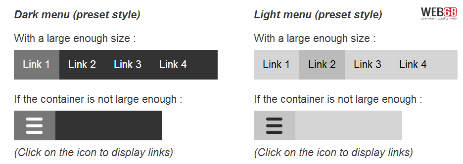
Let's try to create two menu, one fit with the container, and the other is larger than the container and see how PgwMenu adjust itself
<div style="width:33%;min-width:300px">
    <h4><em>Dark menu (preset style)</em></h4>
    <div>With a large enough size :</div>
    <div style="width:275px">
        <ul class="pgwMenu">
            <li><a href="javascript:void(0)" class="selected">Link 1</a></li>
            <li><a href="javascript:void(0)">Link 2</a></li>
            <li><a href="javascript:void(0)">Link 3</a></li>
            <li><a href="javascript:void(0)">Link 4</a></li>
        </ul>
    </div>
    <div>If the container is not large enough :</div>
    <div style="width:200px">
        <ul class="pgwMenu">
            <li><a href="javascript:void(0)" class="selected">Link 1</a></li>
            <li><a href="javascript:void(0)">Link 2</a></li>
            <li><a href="javascript:void(0)">Link 3</a></li>
            <li><a href="javascript:void(0)">Link 4</a></li>
        </ul>
    </div>
    <div><em>(Click on the icon to display links)</em></div>
</div>
DEMO
See the Pen xmckE by Thanh Nguyen (@genievn) on CodePen.
OPTIONS
1. Themes:
PgwMenu comes with two built-in theme: Dark & Light
<!-- DARK THEME -->
<ul class="pgwMenu">
[...]
</ul>

<!-- LIGHT THEME -->
<ul class="pgwMenu light">
[...]
</ul>
Custom theme - To create a custom theme, you can modify and load the included CSS file "pgwmenu-custom.css" instead of "pgwmenu.css".
2. Other options
dropDownLabel - When the drop down link is displayed, you choose between a text and an icon.
$('.pgwMenu').pgwMenu({
        dropDownLabel: 'Menu'
        //dropDownLabel: '<span class="icon"></span>' // Displays the white icon for the dark theme and black for the light theme
        //dropDownLabel: '<span class="white"></span>' // Displays always the white menu icon
        //dropDownLabel: '<span class="black"></span>' // Displays always the black menu icon
});
mainClassName - If you need to modify the default CSS class ("pgwMenu"), you must add the new class to the initialization. Of course, if you modify this class, you also need to update the rules in the CSS file.
$('.pgwMenuCustom').pgwMenu({
	mainClassName: 'pgwMenuCustom'
});