


Super tiny and minimal jQuery slider
INTRODUCTION
Unslider is known to the world as a fantastically tiny slider which takes the content of a HTML unordered list and rotates it at certain preset time intervals.
Created to be as simple as possible, Unslider comes with a bare-bones CSS style, so it can easily be embedded into any live website without disrupting the native design
FEATURES
- Cross browsers
- Keyboard navigation support
- Auto adjusts for height
- Enable/disable autoplay
- Sideways navigation controls
- Touch support
- Yep, it's completely reponsive
HOW TO USE
1. Include jQuery & Unslider
<script src='//ajax.googleapis.com/ajax/libs/jquery/1.11.0/jquery.min.js'></script>
<script src='http://unslider.com/unslider.min.js'></script>
2. HTML
We prepare an <ul> with <li> as item to slide
<div class="banner">
<ul>
<li style="background-image: url('http://unslider.com/img/sunset.jpg');">
<h1>The jQuery slider that just slides.</h1>
<p>No fancy effects or unnecessary markup, and it’s less than 3kb.</p>
<a class="btn" href="#download">Download</a>
</li>
<li style="background-image: url('http://unslider.com/img/wood.jpg');">
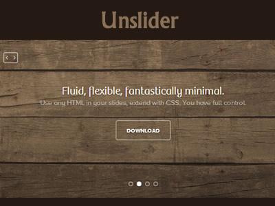
<h1>Fluid, flexible, fantastically minimal.</h1>
<p>Use any HTML in your slides, extend with CSS. You have full control.</p>
<a class="btn" href="#download">Download</a>
</li>
<li style="background-image: url('http://unslider.com/img/subway.jpg');">
<h1>Open-source.</h1>
<p>Everything to do with Unslider is hosted on GitHub.</p>
<a class="btn" href="//github.com/idiot/unslider">Contribute</a>
</li>
<li style="background-image: url('http://unslider.com/img/shop.jpg');">
<h1>Uh, that’s about it.</h1>
<p>I just wanted to show you another slide.</p>
<a class="btn" href="#download">Download</a>
</li>
</ul>
</div>To make it looks nice, we put in a little CSS juice
* {
	margin: 0;
	padding: 0;

	-webkit-font-smoothing: antialiased;

	-webkit-box-sizing: border-box;
	-moz-box-sizing: border-box;
	box-sizing: border-box;
}

::selection {
	background: #bfa57c;
	color: #fff;
}

body {
	color: #a48d66;
	font: 14px/23px proxima-nova-alt, "Proxima Nova Alt", sans-serif;
}
.banner
{
  position:relative;
  width:100%;
  overflow:auto;
  font-size:18px;
  line-height:24px;
  text-align:center;
  color:rgba(255,255,255,.6);
  text-shadow:0 0 1px rgba(0,0,0,.05), 0 1px 2px rgba(0,0,0,.3);
  background:#5b4d3d;
  box-shadow:0 1px 2px rgba(0,0,0,.25);
}

.banner ul
{
  list-style:none;
  width:300%;
}

.banner ul li
{
  display:block;
  float:left;
  width:33%;
  min-height:350px;
  -moz-background-size:100% 100%;
  -o-background-size:100% 100%;
  -ms-background-size:100% 100%;
  background-size: 100% 100%;
  box-shadow:inset 0 -3px 6px rgba(0,0,0,.1);
  padding:160px 0 110px;
}

.banner h1,.banner h2
{
  font-size:40px;
  line-height:52px;
  color:#fff;
}

.banner .btn
{
  display:inline-block;
  clear:both;
  color:#fff;
  font-size:12px;
  font-weight:700;
  text-transform:uppercase;
  text-decoration:none;
  border:2px solid rgba(255,255,255,.4);
  border-radius:5px;
  margin:25px 0 0;
  padding:9px 22px 7px;
}

.banner .btn:hover
{
  background:rgba(255,255,255,.05);
}

.banner .btn:active
{
  -webkit-filter:drop-shadow(0-1px2pxrgba(0,0,0,.5));
  -moz-filter:drop-shadow(0-1px2pxrgba(0,0,0,.5));
  -ms-filter:drop-shadow(0-1px2pxrgba(0,0,0,.5));
  -o-filter:drop-shadow(0-1px2pxrgba(0,0,0,.5));
  filter:drop-shadow(0-1px2pxrgba(0,0,0,.5));
}

.banner .btn,.banner .dot
{
  -webkit-filter:drop-shadow(01px2pxrgba(0,0,0,.3));
  -moz-filter:drop-shadow(01px2pxrgba(0,0,0,.3));
  -ms-filter:drop-shadow(01px2pxrgba(0,0,0,.3));
  -o-filter:drop-shadow(01px2pxrgba(0,0,0,.3));
  filter:drop-shadow(01px2pxrgba(0,0,0,.3));
}

.banner .dots
{
  position:absolute;
  left:0;
  right:0;
  bottom:20px;
}

.banner .dots li
{
  display:inline-block;
  width:10px;
  height:10px;
  text-indent:-999em;
  border:2px solid #fff;
  border-radius:6px;
  cursor:pointer;
  opacity:.4;
  -webkit-transition:background .5s, opacity .5s;
  -moz-transition:background .5s, opacity .5s;
  transition:background .5s, opacity .5s;
  margin:0 4px;
}

.banner .dots li.active
{
  background:#fff;
  opacity:1;
}
3. Now it's time to make the slider
$(function() {
    $('.banner').unslider({
      speed: 500,               //  The speed to animate each slide (in milliseconds)
      delay: 3000,              //  The delay between slide animations (in milliseconds)
      complete: function() {},  //  A function that gets called after every slide animation
      keys: true,               //  Enable keyboard (left, right) arrow shortcuts
      dots: true,               //  Display dot navigation
      fluid: true              //  Support responsive design. May break non-responsive designs
    });
});
DEMO
See the Pen unslider by Thanh Nguyen (@genievn) on CodePen.