


Sweet and beautiful replacement for javascript alert
INTRODUCTION
SweetAlert is a very nice and cool alternative to using the ugly default Javascript alert box. It will surprise you from the first time using with its elegant and polish user interface. Moreover, it allows multiple options and callbacks while staying small and simple. SweetAlert is a must-have in your javascript collections.
INSTALLATION WITH BOWER
bower install sweetalertHOW TO USE
1. Include CSS & Javascript
<link rel='stylesheet' href='https://cdn.rawgit.com/t4t5/sweetalert/v0.2.0/lib/sweet-alert.css'>
<script src='https://cdn.rawgit.com/t4t5/sweetalert/v0.2.0/lib/sweet-alert.min.js'></script>
2. HTML
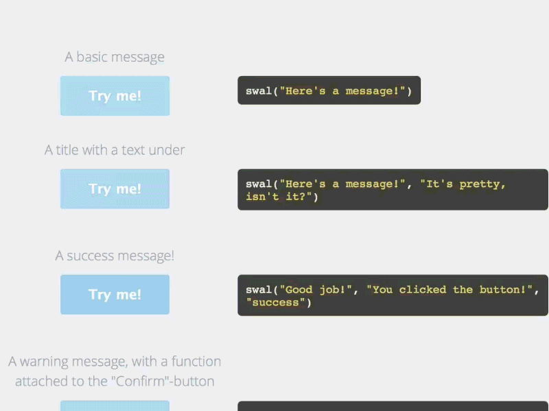
We will prepare few buttons to test how powerful SweetAlert is
<div class="example">
  <button id="b1">A basic message</button>
  <button id="b2">A title with a text under</button>
  <button id="b3">A success message!</button>
  <button id="b4">A warning message, with a function attached to the "Confirm"-button...</button>
  <button id="b5">... and by passing a parameter, you can execute something else for "Cancel".</button>
  <button id="b6">A message with a custom icon</button>
</div>
3. CSS
Make it more beautiful with a little of CSS
.example button {
  float: left;
  background-color: #4E3E55;
  color: white;
  border: none;
  box-shadow: none;
  font-size: 17px;
  font-weight: 500;
  font-weight: 600;
  border-radius: 3px;
  padding: 15px 35px;
  margin: 26px 5px 0 5px;
  cursor: pointer;
}
.example button:focus{
  outline: none;
}
.example button:hover{
  background-color: #33DE23;
}
.example button:active{
  background-color: #81ccee;
}
4. Call SweetAlert
As you see, we need to call only one function swal(), to which you can pass many options to customize how it looks and behaves.
document.getElementById('b1').onclick = function(){
	swal("Here's a message!");
};

document.getElementById('b2').onclick = function(){
	swal("Here's a message!", "It's pretty, isn't it?")
};

document.getElementById('b3').onclick = function(){
	swal("Good job!", "You clicked the button!", "success");
};

document.getElementById('b4').onclick = function(){
	swal({
		title: "Are you sure?",
		text: "You will not be able to recover this imaginary file!",
		type: "warning",
		showCancelButton: true,
		confirmButtonColor: '#DD6B55',
		confirmButtonText: 'Yes, delete it!',
		closeOnConfirm: false,
		//closeOnCancel: false
	},
	function(){
		swal("Deleted!", "Your imaginary file has been deleted!", "success");
	});
};

document.getElementById('b5').onclick = function(){
	swal({
		title: "Are you sure?",
		text: "You will not be able to recover this imaginary file!",
		type: "warning",
		showCancelButton: true,
		confirmButtonColor: '#DD6B55',
		confirmButtonText: 'Yes, delete it!',
		cancelButtonText: "No, cancel plx!",
		closeOnConfirm: false,
		closeOnCancel: false
	},
	function(isConfirm){
    if (isConfirm){
      swal("Deleted!", "Your imaginary file has been deleted!", "success");
    } else {
      swal("Cancelled", "Your imaginary file is safe :)", "error");
    }
	});
};

document.getElementById('b6').onclick = function(){
	swal({
		title: "Sweet!",
		text: "Here's a custom image.",
		imageUrl: 'http://i.imgur.com/4NZ6uLY.jpg'
	});
};
DEMO
See the Pen sweetalert demo by Thanh Nguyen (@genievn) on CodePen.
OPTIONS
| Argument | Default value |
|
|---|---|---|
| title | null (required) | The title of the modal. It can either be added to the object under the key "title" or passed as the first parameter of the function. |
| text | null | A description for the modal. It can either be added to the object under the key "text" or passed as the second parameter of the function. |
| type | null | The type of the modal. SweetAlert comes with 4 built-in types which will show a corresponding icon animation: "warning", "error", "success" and "info". It can either be put in the array under the key "type" or passed as the third parameter of the function. |
| allowOutsideClick | false | If set to true, the user can dismiss the modal by clicking outside it. |
| showCancelButton | false | If set to true, a "Cancel"-button will be shown, which the user can click on to dismiss the modal. |
| confirmButtonText | "OK" | Use this to change the text on the "Confirm"-button. If showCancelButton is set as true, the confirm button will automatically show "Confirm" instead of "OK". |
| confirmButtonColor | "#AEDEF4" | Use this to change the background color of the "Confirm"-button (must be a HEX value). |
| cancelButtonText | "Cancel" | Use this to change the text on the "Cancel"-button. |
| closeOnConfirm | true | Set to false if you want the modal to stay open even if the user presses the "Confirm"-button. This is especially useful if the function attached to the "Confirm"-button is another SweetAlert. |
| closeOnCancel | true | Set to false if you want the modal to stay open even if the user presses the "Cancel"-button. This is especially useful if the function attached to the "Cancel"-button is another SweetAlert. |
| imageUrl | null | Add a customized icon for the modal. Should contain a string with the path to the image. |
| imageSize | "80x80" | If imageUrl is set, you can specify imageSize to describes how big you want the icon to be in px. Pass in a string with two values separated by an "x". The first value is the width, the second is the height. |